How to improve your Data visualizations
Today, wherever there is a business, there is data behind it. Understanding this data can be a daunting task, especially for those who are not well-versed in data analysis. This is where data visualization comes into play.
What is Data Visualization?
“A picture is worth a thousand words.” - Confucius
This adage captures the essence of data visualization. Data visualization is the transformation of information into a visual format, such as a bar chart, pie chart, or color-coded sequence of numbers. Its purpose is to allow humans to quickly grasp the main information being communicated , bypassing the need for tedious sentences or large Excel tables. A good data visualization addresses a business problem almost instantly.
A Quick Example:
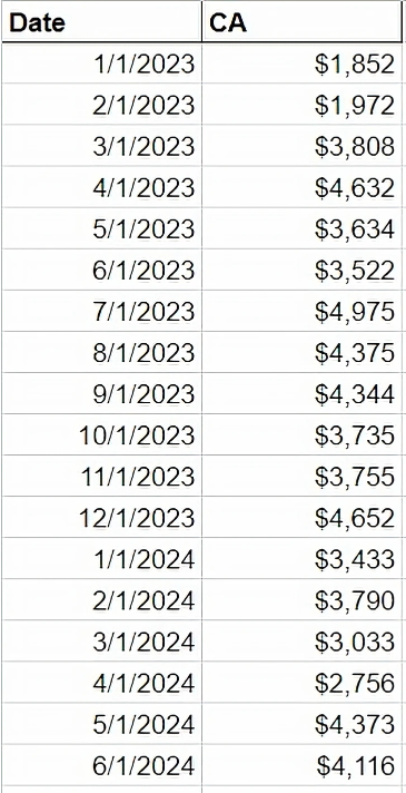
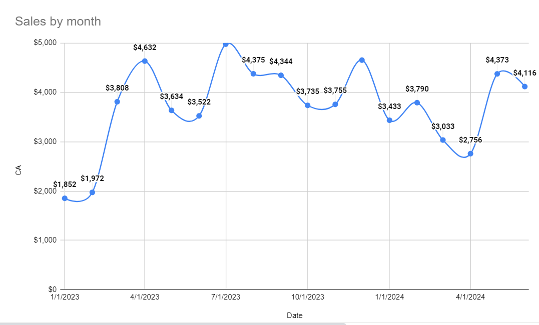
Imagine you run a sales company and you want to know if this month's sales have improved compared to the previous month or the same month last year. What’s the simplest way to get this information? Should you sift through your spreadsheet, or simply at a timeline graph of your monthly sales? Below is an example of a table and its corresponding graph:


Which method helps you understand the trend more quickly? The graph likely gives you a more immediate and clear understanding of your sales performance. And indeed, scientific studies show that human eyes process visuals 60,000 times faster than text.
How to Create the Best Data Visualization Dashboards?
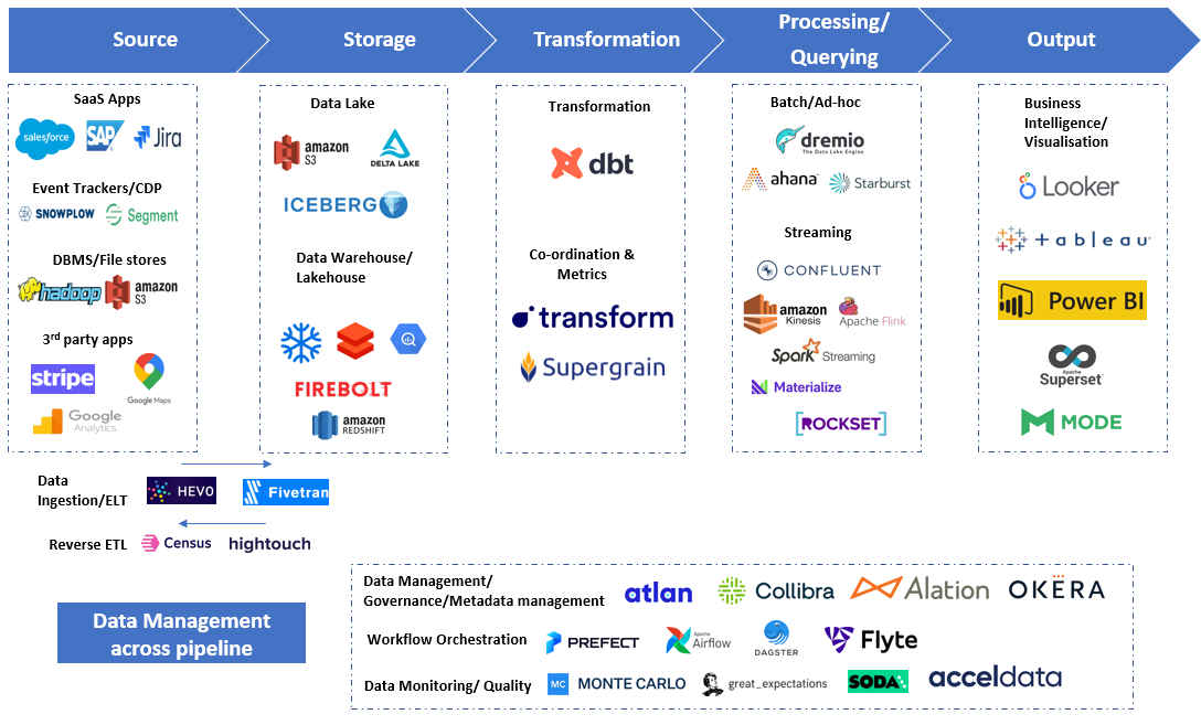
Many excellent tools are available for data visualization, with Tableau, Qlik, and PowerBI being among the most popular. Each has its strengths and weaknesses, but regardless of the tool, some principles remain constant for effective data visualization.
1. Data model is the key
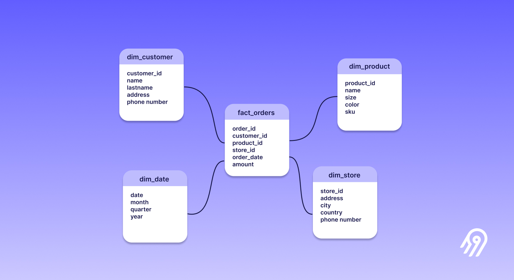
I cannot talk about data visualization without talking about data modeling. After all, how can someone build a house without strong walls? The analogy can seem a little bit cheesy, but it is nonetheless true. And of course, the walls have to be adapted to the house you are building. Consider these three points when developing your data model:
- Granularity: Is the granularity of your data appropriate for what you want to show?
- Clarity: Can you easily comprehend and explain any KPI or graph displayed on your dashboard?
- Performance: Is the data load manageable for your tool? If not, what can you do to improve it?

Exemple of a classic star schema modelisation
If you address these points, you will have a solid foundation for your visualizations.
2. Keep it simple
How we like to control everything. To have everything we want at the tips of our hand. After all, why not have 30 visualizations with a total of 180 KPIs shown in only one dashboard? But consider this: overloading a dashboard can slow down its performance and overwhelm the user. Here's what you can always keep in mind when constructing your dashboards:
- The more visualizations you add, the slower the dashboard will be . Do you know how frustrating it is to have to wait 5 minutes before your graph shows up? Try to reduce to the minimum the number of visualizations and KPIs by dashboard. One dashboard should address one business problem, with the least KPIs and graphs possible. Furthermore, too much information can cause stakeholders to lose interest .
- The more calculations (especially complex ones) made with the tool, again, the slower it will be. This is especially true if you try to mix multiple granularities in the same graphs or sheets . Complex calculations should be handled in the data model, not within the dashboard tool. Document these calculations clearly, and use tooltips to explain how values are derived.
3. Understand the business need
This is perhaps the most important point. A data visualization is not here to (only) play pretty. It should serve a business need, making life easier for the end-user, not harder. Without a clear business purpose, a data visualization is pointless. When the business need is not well understood, dashboards can become cluttered with unnecessary visualizations and information. Always start with a clear understanding of the problem you are trying to solve.
Final Thoughts
Data visualization is not magic, but when built on a solid foundation with a clear vision, it can significantly enhance the value of your work. Always keep in mind why you are creating dashboards and use them wisely. I hope you enjoyed this article, don't hesitate to contact me if you have further questions!
